

When you bring up the name “Max Watanabe” in the context of mecha and anime model making, most minds immediately go to his company Max Factory. As the author of numerous gunpla modeling books in the ’90s and the founder of a company today known for modern versions of classic ’80s anime subjects like Dougram or Patlabor, it’s easy to assume his ties to modeling might are limited to giant robot anime.
However, Max also has a longstanding relationship with the world of Maschinen Krieger/SF3D (including a personal friendship with creator Kow Yokoyama) and has published several Maschinen Krieger (Ma.K) modeling books as well – including one that has over 100 completed S.A.F.S. kits painted in almost every conceivable camouflage scheme.

Looking at his Ma.K work, you notice a fairly distinct style – one that keeps to the typical rough and tumble weathered style of Ma.K via lacquer hand painting, but with a unique twist: a chromatic multi-colored undercoat that creates the look of mottled texture. Combined with some clever brush handling and layering of the top colors, it’s quite easy to get good looking results that are ready for weathering – in fact, I would almost recommend this technique to someone looking to get into lacquer hand painting as a transition from airbrushing as it uses a similar principle of creating the modulation and shifts before the final color. Let’s use a Wave 1/20 AFSSA E3C/E3CB Luna Pawn as our example and break this technique down!

We start with a fairly glossy or semi-gloss/satin black base, you can use a black primer, but I find that many lacquer-based primers tend to go on matte because they have micro-filler in them (for sanding scars, etc). For this project, a layer of standard Mr. Color Gray Primer was sprayed on and then a layer of standard Gaianotes Black was applied over it. Since our final color layers are quite light in tone, this will allow us to build up to the final color with multiple layers.

Here’s where the fun begins – we pick a variety of bright colors, the more vibrant the better. Starting with a standard primary triad of plain blue, yellow, and red, a minty green is also added for another cool tone as this is a space suit and the plan for the final build with basing is a cold and austere lunar scene. We’re using a mix of Gaianotes, Mr. Gundam Color, and Tamiya Acrylics (despite being called acrylics, the Tamiya paints can be thinned using a standard lacquer thinner such as Mr. Leveling Thinner or Gaia Brush Master).
Using our bright colors we apply them as haphazardly as possible over the black base–this step can be done either with airbrush or hand paint strokes, but airbrush was elected for this model to save a little time as it was already setup from the black basing. As random and mixed-up as possible is the key here, with no concern if the colors mix or overlap at any point as we will eventually reactivate these layers with the hand paint colors down the line.

We apply this to every part of the armor of the kit, you can mask the “cloth” joints if you wish (in some of the Max’s Ma.K books, he uses masking fluid to cover the joints before this step – he sometimes leaves the joints a raw polycap material color!), however since we are planning to come in and paint these again later, we can ignore that for now. About two or three passes with each color was given here, with plenty of variation on the direction and area coverage of each each color per limb and armor panel.

Selecting our colors for the final finish – these Gaianotes Dougram colors have some great muted anime hues that look good on a space mecha, so we are using a lavender, cool purple, and a standard Gaianotes off-white known as “Interior Color” (which is also probably the name of a terrible indie rock band).

Preparing to start the layered painting, we want a thinner mix that will reactivate the previous color splotches and give plenty of working time, so we use plenty of retarder in our thinner. I’m using Gaianotes thinner along with Gaianotes retarder in approximately an 80:20 mix, this will give a good slow drying time (for lacquer) and self-leveling finish when brush painting. The thinner and retarder are premixed in an empty container so plenty is on tap during the hand painting process.

We prepare the colors for hand paint by mixing in some of our thinner-retarder mix in a color tray–we want a fairly thin mixture here that will go on almost translucent at first. The thinning leveling that appears to work well can best be described as if paint straight from the bottle is a 1 and paint highly thinned for detailed airbrushing is a 10, we want the mixture to be around a 6-7; enough that our brush load is good enough for coverage but will require multiple of coats to achieve any kind of coverage of color over the base coat.

For brushes, the standard pairing of a flat for armor panels and a good round for getting into angled areas and creating fades and those distinctly “Ma.K-ish” edges between colors in the camo scheme are our go-to brushes for this project. Being a suit and not a larger walker or vehicle, just two brushes is plenty as we don’t have to worry about very large areas of coverage – this technique is just as applicable to a larger project as well (and in fact looks great on something with huge armor panels like a Lunadiver or Nutcracker), just size up the brushes and amount of color splotching in the previous steps accordingly.

We begin applying the colors to the body of the suit with the flat brush – you can see in the image how thin the coats are as much of the underlying color is still visible. Also, with the thinner-heavy brush load, you will notice that it is likely to reactivate some of the color splotches and begin moving them around a bit – this is good and exactly what we want! This effect is what will create the depth and texture of the final finish.

Here as we continue this first thin layer, you can see how the brush is starting to actually move around some of the sloppily applied bright colors – especially on the backpack. Using the flat brush, we follow the contours of the suit with the brush strokes (see the previous tutorial for a little more on this). At this point, we don’t want to start building up to a covered coat in any one area yet, it’s best to work all over for everywhere a certain color might go in even thin layers.

A clearer look at how things should look after a few passes: the area under the backpack engine hump has been only given one pass and there is only a faint hint of the off-white so far. The fuel tanks on the sides and the engine cover have had about two or three coats and are starting to gain coverage, but there are still plenty of bright colors peeking through. It can be seen where the bright colors are starting to reactivate and pull/blend with the off-white inside of the brushstrokes.

After a few more passes the accumulation of many passes of retarder-laden thinner will start to seep into the underlying color splotches and they may start to actually become even more vibrant and mixed up into the finish color. At this point, you can tweak your thinner mix to have a little less retarder or to use a slightly paint heavier brush load in order to increase coverage, alternately for a very textured and soft-focus look, you can continue to build up in equally thin layers.

This is after seven or eight passes on the body, and coverage is starting to show. The chromatic color layer is providing some nice shifts and texture to the finish already. Let’s continue building it up!

Here the top of the body is nearing final coverage – in contrast to the lower waist panel which is still at about half coverage. At this point, the off-white finish is starting to be added almost in a “cross hatch” style pattern with multi-directional paint strokes and no longer just following the contours of the shape of the model. On things like the engine cover, you can see that the chromatic color effect has given some interesting potential for the weathering stage as it has created some effects that could easily be turned into stains, paint wear, chips, or fading.
Naturally, we repeat this process with the limbs and other parts of the model as well. Here we can see the legs of the AFS at about half-coverage level.

And here they are at full coverage, again we can see how the chromatic shifted color splotches have created a great texture under the paint finish–especially for a simple finish like Ma.K space suit off-white, this is a great way to add some visual interest to an otherwise fairly plain appearance.

Due to the many thin layers and the constant reactivation of the under-colors, you may notice that the brush becomes quickly stained with the bright colors, you can either use this to your advantage to move and blend the chromatic layer into your finish even more or for a more clean and even result, keep some shop towels damped with a little brush cleaner or thinner on hand to clean the brush between layers.

We also now repeat the process with our other color for this scheme – a mix of the Dougram colors in alternating layers–here it is shown at about 2-3 layers each of the lavender and purple. You can see that minty electric green is coming in nicely here to offset the purple with white and help tie them together a little bit. Once oil paints are applied during the weathering stage to tie them even more, this can be a great way to make clashing camo schemes work in harmony.

And here it is with a finished level of coverage for both colors in the paint scheme. It is definitely a subtle effect once completed and can tend to get somewhat lost if it is an especially busy camouflage scheme such as one with lots of patterns or several colors. However, the next time you are making a classic all-over Anti-Flash White SAFS Snake-Eye, give it a try and see how effective it can be.

The final step in the painting process is adding small accents of the purple/lavender to a few other parts of the suit such as the arms as well as mixing up a quick and dirty dark gray-olive color to cover the joints with.
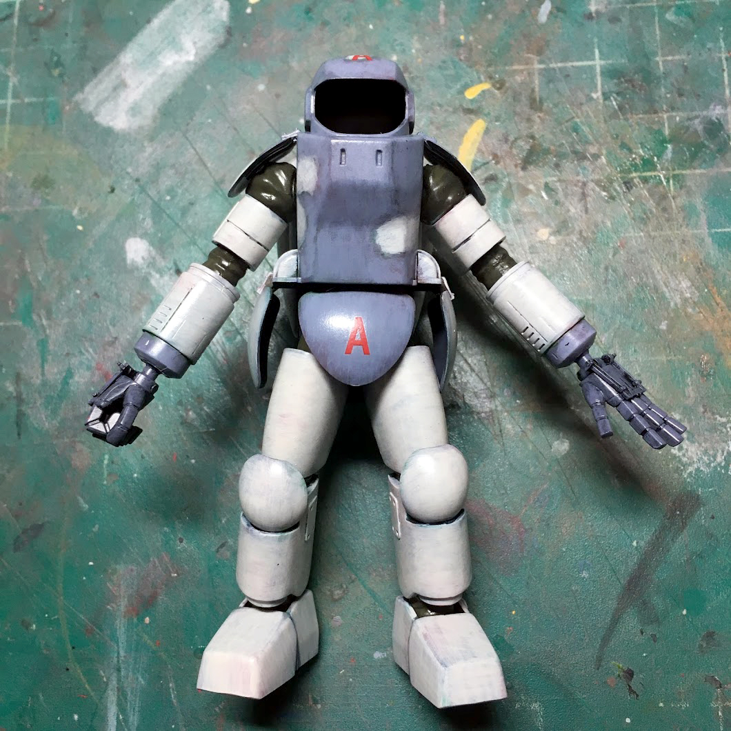
Finished base paint. Especially on the back, as it is a single color, the effect of this technique is really noticeable as it adds a good deal of depth and modulation to an otherwise unremarkable color choice. This is a really unique and fun technique from someone who is undeniably a pillar of the mecha and anime scale modeling world so it is definitely worth a try–even beyond things like Ma.K, there are plenty of Hobby Japan articles where Max Watanabe has done this effect on gunpla, Dougram, and even one of those colossal 1/20 Strike Valkyrie kits.

As a final look – after weathering, where oil paints that recalled some of the underlying colors were used as filters and pin washes, the scheme is tied together and the fact that there is both modulation underneath and on top of the finish lends a fantastic sense of scale and texture to the model.

We hope you enjoyed this tutorial and are excited to try the Max technique on one of your upcoming builds – just don’t forget to wear some sort of incredibly loud patterned shirt and make the most aggressively chipper smile you can in true Max fashion!
Support us on Patreon!
Contributor articles like this are made possible by our readers. If you enjoyed this content, please support Zimmerit on Patreon.
